Colour is a topic that you will need to think about if you’re looking to create a brand around your business. Colour makes a powerful impression and sets the tone for how people feel about the business. Choose the wrong colour when getting your logo designed and you might put off the very people you need to attract. Alternatively if you get it right, you will make the business of promoting your wares so much easier.
So, how exactly do you know which colours to choose for your brand? It can be a complex process. Colour psychology is a good place to start.
What are brand colours examples?
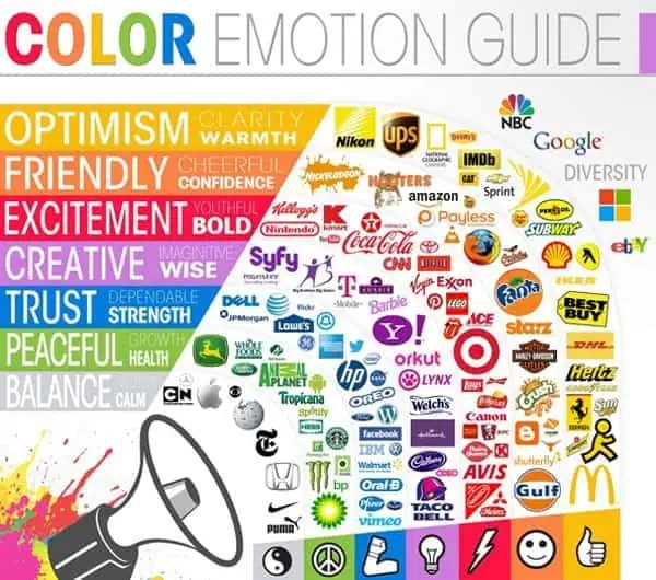
Your choice of colours can say a lot about your brand; this is because different colours combinations tend to invoke different emotions.
If you take a look at the colour guide (pictured above), you’ll start to get a basic idea of how colours can affect the way your brand is perceived.
Do colours matter in branding?
In general, the colour red is perceived to be an exciting, bold and energetic colour, which is why the colour is used by the likes of Coca Cola, McDonalds and Virgin (i.e., brands that embody a lively, bold, or exciting persona).
On the other hand, blue tends to be perceived as strong or dependable, whereas yellow is perceived as warm and optimistic.
While they are not on the chart, gold and silver, when presented in an uncluttered manner, are perceived as prestige. Nothing shouts high status more than metallic foil business cards.
Clearly then, colour can make a difference when it comes to the way that you/your brand is perceived, but how do you know which colours to choose?
The answer: you choose colours that embody the essence of your particular brand.

For example, you’ll notice that the Etsy logo is predominantly orange; this is because orange portrays a friendly, cheerful and confident image, which is what the Etsy brand is all about.
What is an example of the brand colour blue?
On the other hand, Facebook mainly utilises blue in their branding. The reason for this is simple: blue comes across as trustworthy and dependable: two extremely important qualities for a service used by millions everyday (and also a service that millions of people trust with extremely private information).

This is also the reason banking and insurances often use blue. Think the Halifax Bank, Barclays, even Lloyds have watered down their green background with some blue.
Take some time to think about how you want your brand to be perceived (e.g. trustworthy, creative, youthful, etc.), and choose colours that embody those ideas.
Why choose green?
Green is often chosen to symbolism nature and the environment. However, there are many different shades of green, and the implications can vary widely. Lime green, for example, has been a fashion choice recently, so it is a colour currently associated with being up to the minute and in vogue.
Forest green conveys solidity and security and as such is used in legal and financial firms.
Mint green implies calmness and relaxation and is often used by health and wellbeing businesses.
Choose Contrasting Colours

Typically, organisations make use of more than one colour in their branding, and you might have noticed that these colours are nearly always contrasting.
For example, take a look at the McDonalds logo.
This logo makes use of red and yellow: two of the most contrasting colours out there. It’s the same story with the Etsy logo (featured earlier in the post); it makes use of orange and white, two more highly contrasting colours.
But why is this important?

If you take a look at the image above, you’ll notice that out of the three choices, only one is labelled “good choice”; this is the choice that makes use of two highly contrasting colours.
You’ll also notice that the other two (bad) choices are quite difficult to read, and certainly don’t have much of an impact.
It’s extremely important that your brand has as much impact as possible; you want your brand to be bold and memorable, which won’t be the case if you use a poor colour combination.
Plus, choosing 2-3 contrasting colours allows you to embody more emotions in some cases.
For example, McDonalds makes use of red and yellow, which helps to ensure that the brand comes across as bold and exciting, but also warm and optimistic.
Choose Colours That Will Allow You to “Stand Out” in Your Industry

No matter what industry your business is operating in, you can pretty much guarantee that you’ve got your fair share of competition.
Even if you’re only running a small, home-based, local business, there will be others doing something similar, so it’s important that you do everything in your power to stand out from the crowd.
Now, there are a lot of ways to do this (e.g. by creating a unique brand, by creating unique products, etc.), but colour can also help.
The best way to start is to look at your competition and make notes regarding the colours they’re using to brand themselves.
More often than not, you’ll find the same colours cropping up time and time again (example: the use of blue in the computer industry – pictured above).
If you find this to be the case, the solution isn’t simply to copy the competition, but instead, to choose colours that are completely different and unique.

Apple is a company that took this exact approach back in the 80’s, as you can see from the image on the right.
Rather than fitting in with the dull, corporate, blue identities that their competitors were using, they opted for a colourful, friendly “apple” logo instead.
This helped them to stand out from the crowd (plus it also helped embody the “think different” aspect of their brand).
So, look at the competition in your industry/area, and if they’re all using the same colours, choose something different and stand out.
Don’t Use Too Many Colours

While this piece of advice may seem a little contradictory (given the fact that the multi-coloured Apple logo was used as a good example, above), it’s typically a bad idea to make use of too many colours in your branding.
If you do use too many colours, you may end up with a (terrible) design like the business card on the right.
By making use of too many colours, the business card comes across as overwhelming, cluttered, and has no clear identity.
It doesn’t connect with anyone in particular, and it gives no clear indication regarding the nature of the brand (i.e. what the brand is all about).

However, each business card above makes use of only two colours, which helps them to come across as clean, professional, and highly readable.
It also gives you an insight into the brand itself, as the minimalistic nature of the business cards helps to create a picture of a simple, understated brand with close attention to detail.
The bottom line is this: don’t use too many colours. Pick 2-3 and stick with them.
Don’t Use Different Colours in Print and Online
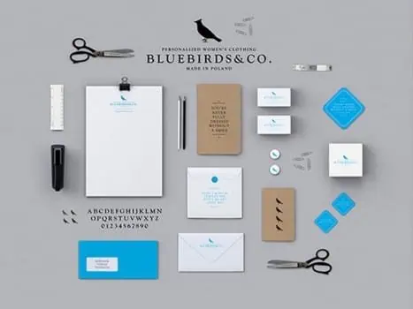
Lastly, it’s important to note that the colours you make use of online should match the colours use in printed marketing materials (e.g., flyers, business cards, posters, etc.)
If you fail to do this, your brand will appear inconsistent and will give mixed messages/perceptions.
You can see a good example of how to do this above, from Bluebirds & Co.
You’ll notice that they make use of a consistent blue/white colour scheme throughout their printed marketing materials, which is a great start.
But, they also make use of the same colour scheme on their website, bringing consistency to their online/offline branding and marketing efforts.
It’s simple really: keep things as consistent as possible when it comes to your brand’s colours, and you won’t go far wrong.
Liz Wiley MBA is Editor of Prowess.org.uk and a qualified SFEDI-accredited business adviser, coach and enterprise trainer with more than 15 years’ experience supporting entrepreneurs and small business owners across the UK. She has designed and delivered start-up, growth and leadership programmes for public sector agencies, universities and enterprise organisations, working directly with founders at every stage of development.
Her expertise includes business planning, financial sustainability, strategic growth and confidence development, with a particular focus on supporting women founders to build resilient, scalable businesses.
Liz holds a Master of Business Administration from the Open University and has recently completed a Diploma in Digital Marketing with the Digital Marketing Institute, strengthening her advisory work in online growth strategy and digital positioning.

